![](https://cdn.myportfolio.com/eedc5962-b09d-41d3-89d8-e08e4ea40cac/f0c7411b-cbe8-4902-bb24-cdaad9e02eb1_rw_3840.png?h=959f5346092b0a7481e21e315cca8d4d)
Big icons were mostly used in splash pages.
Design role
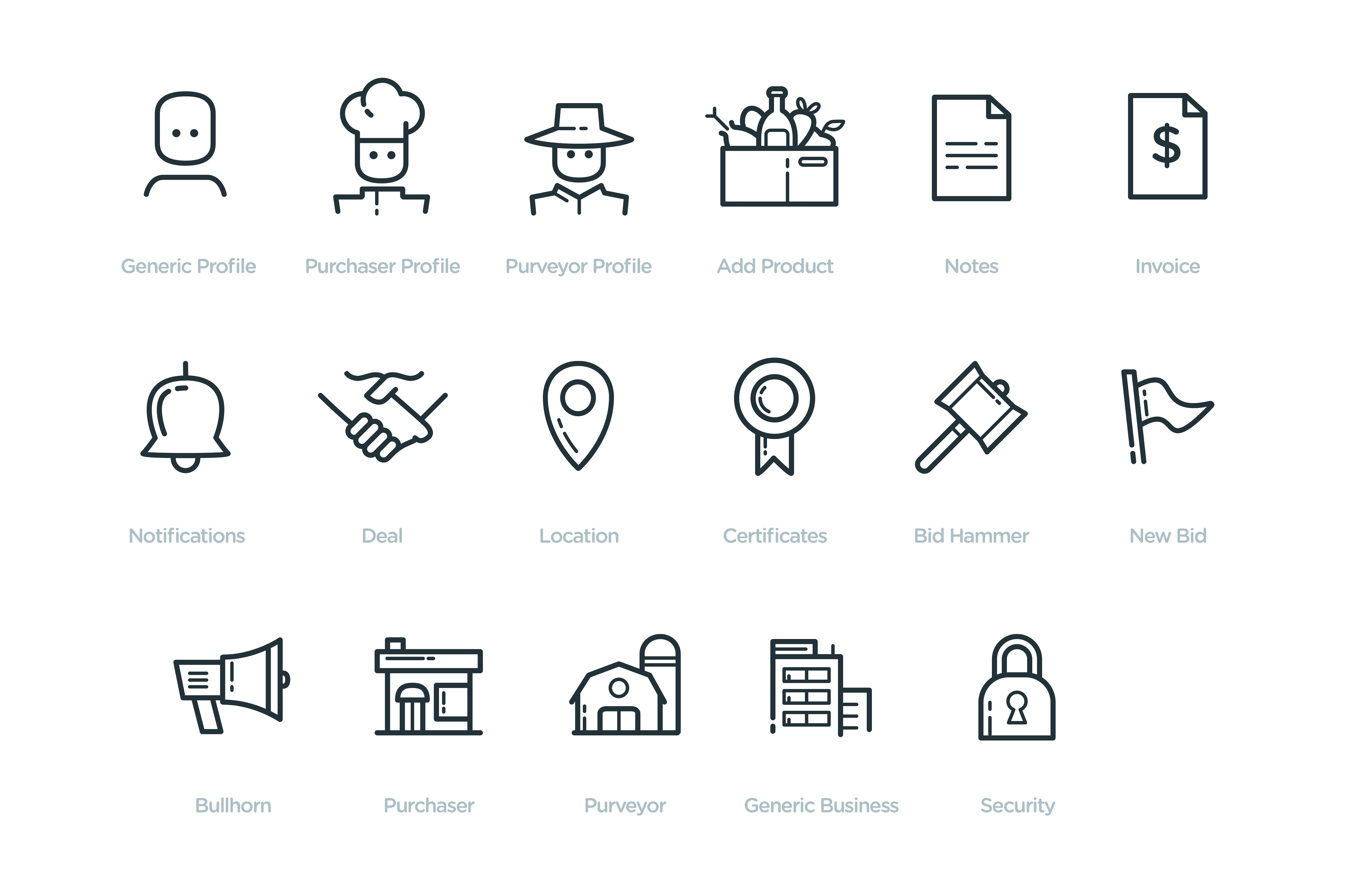
I was hired to work on WhatsGood product UI. During that time most of my work was devoted to designing a huge iconset that would help their apps to have a unified look & feel.
![](https://cdn.myportfolio.com/eedc5962-b09d-41d3-89d8-e08e4ea40cac/884d3358-ad6a-4cf3-b4e6-53eee279a06d_rw_3840.png?h=c847a0ece401739f8036b3cbde64ff4a)
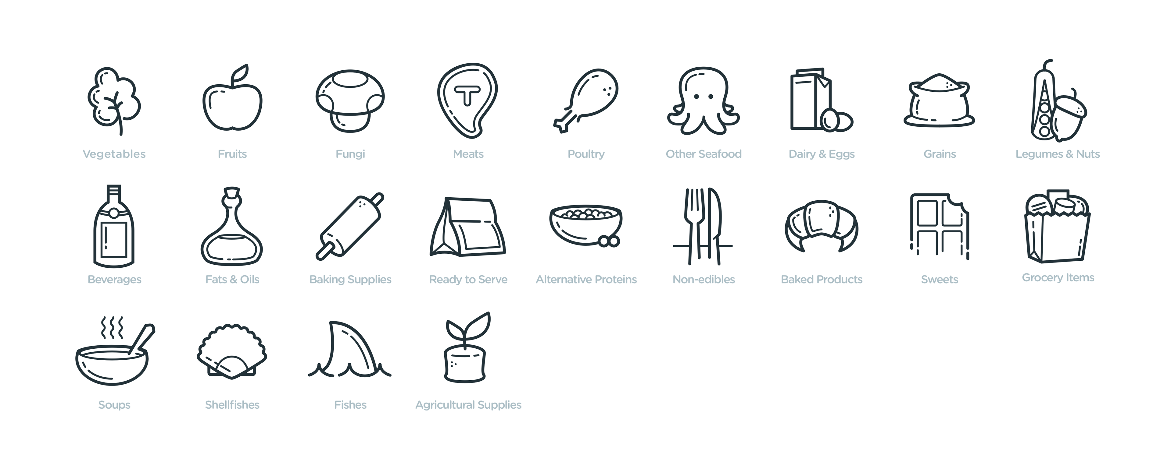
A lot of the icons were used specifically to illustrate food categories and subcategories.
![](https://cdn.myportfolio.com/eedc5962-b09d-41d3-89d8-e08e4ea40cac/1a60f806-16f1-4672-b47a-4e251076d3e1_rw_3840.png?h=0560babc48a9198e6ee465d97e84e0f4)
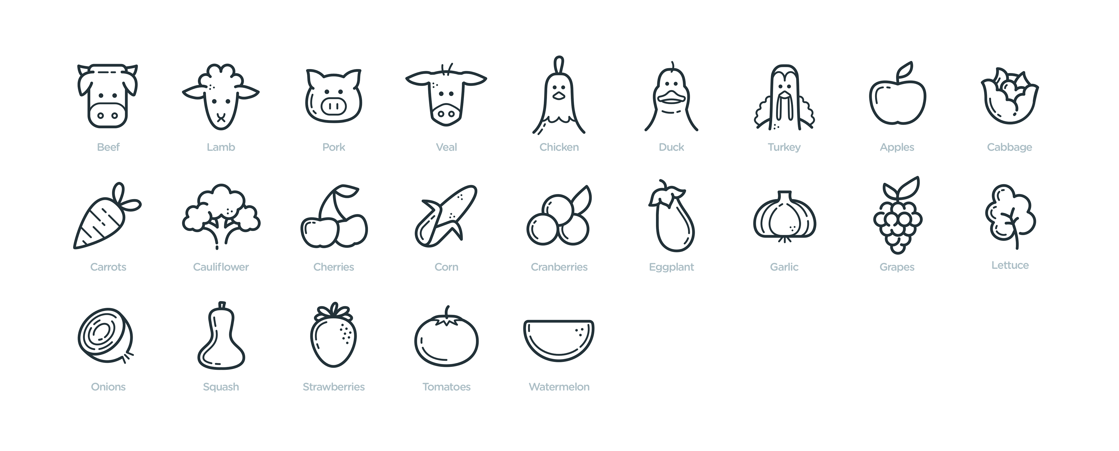
Even more food types :)
![](https://cdn.myportfolio.com/eedc5962-b09d-41d3-89d8-e08e4ea40cac/5f08bb81-9d96-42d0-912a-44e22c2d66a5_rw_3840.png?h=d048d6482f7e5e74e768814a5f188052)
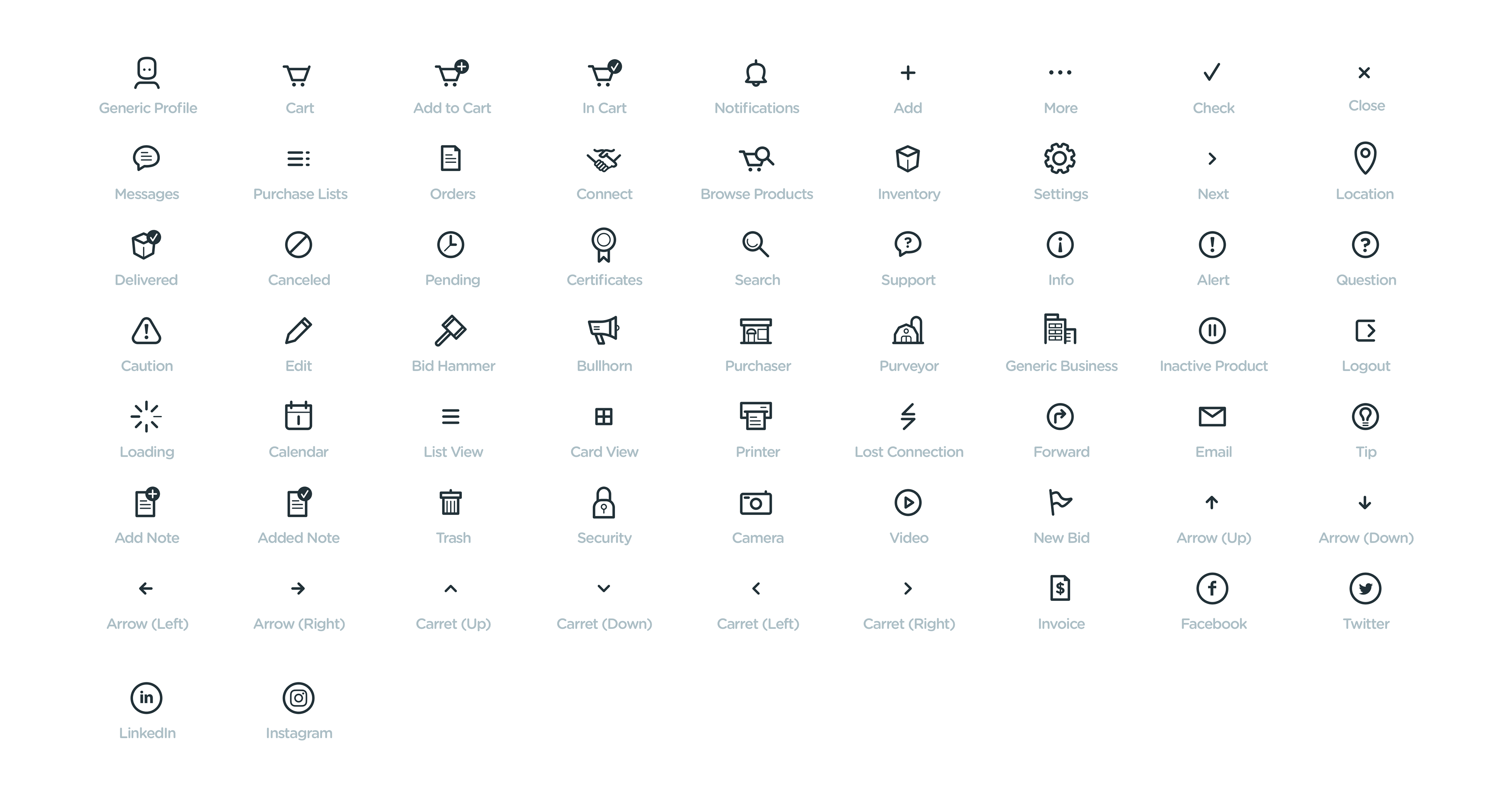
Some icons were purely function-oriented and were used throughout the mobile and web apps.